
We are a strategic design studio. We create services, from digital products to spaces, through human-centred research and innovation.
Nippon Sanso
A solid group, a reference in industrial gases, but with one key inconsistency: the visual coherence of its global brand.
Nippon Sanso operates a group of industrial gas companies across Japan, Europe, the Americas and Asia-Pacific — among them Taiyo Nippon Sanso, Nippon Gases Europe, Matheson and Supagas. Each had grown with its own identity, culture, and relationship with the market. Our goal was to bring all of that together into a single global visual identity, adapted to each region and rooted in the company's Japanese know-how, without erasing the values that set it apart from its competitors.
Nippon Sanso
Industrial Gases
A global brand, fragmented visually. GRAND had the glue they needed.
Behind each regional logo was a different organisation, with its own governance, processes, and language with the client. The disconnect ran deeper than the visual; it also affected the way the group’s companies related to each other and to their own teams. Before designing anything, we had to understand where these ecosystems coexisted and where they collided.
We listened globally. We acted globally.
We interviewed Brand Managers and CEOs from each region, and extended that listening to sales teams, R&D, human resources, and production plants across every company in the group; over sixty conversations in total. We mapped the global brand landscape, market by market, and reconstructed the business and communication flows connecting each subsidiary to the rest. Only with that first sketch of the full picture could we start laying the groundwork for what would become the global brand.

From blueprint to definition,
from design to global reach
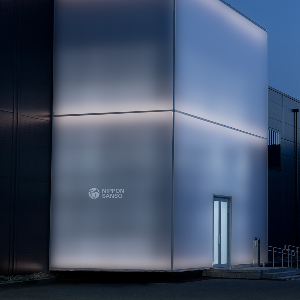
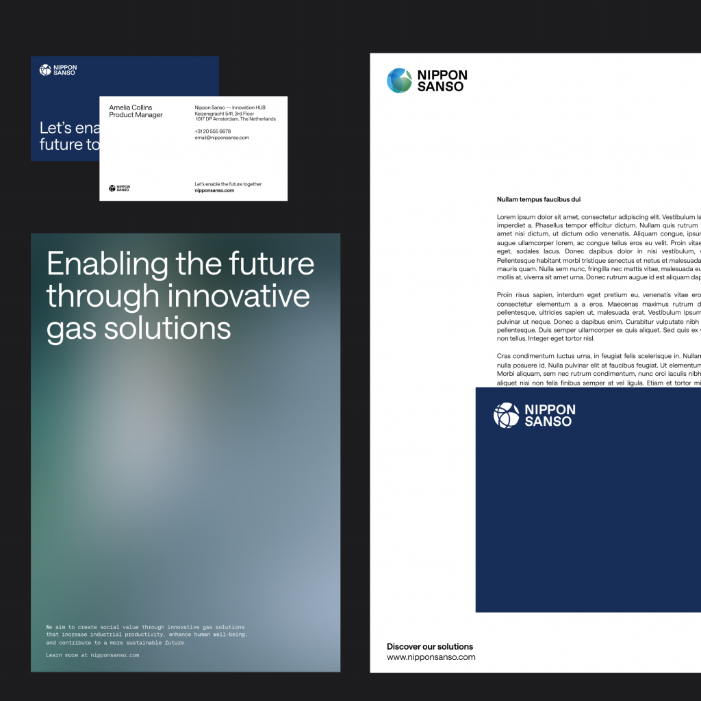
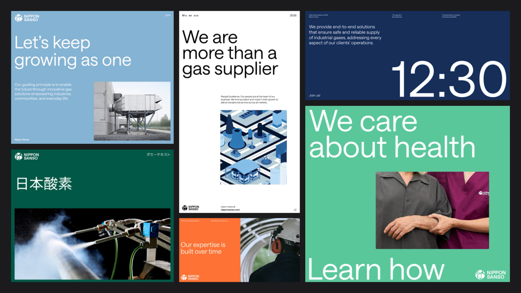
Nippon Sanso didn’t lack personality. It lacked a language to express it. We designed a three-tier brand system: the master brand, sub-brands, and joint ventures, that structures the relationship between Nippon Sanso and each of its operations according to their degree of ownership. The challenge was for all of them to breathe through the same visual lung. That’s where Ethereal Engineering was born: decades of industrial precision and Japanese heritage distilled into a shared visual and verbal language for every region. The typography, fully chameleonic, combines Latin alphabets with Asian writing systems so that the brand speaks the same visual language in every market, while always adapting to each. All of that means any team, anywhere in the world, can apply the same design and tone standards, bringing Nippon Sanso into the global territory it was always meant to occupy.
From fragmentation to
unification, together.
1 April 2026 was the day the world met Nippon Sanso as a global brand. Group companies that had grown apart for decades woke up that day under a unified global brand. What started as a diagnosis is now a complete brand platform, with a coherent visual identity manual and a five-year implementation roadmap already underway.
A rebrand of this scale demands more than a manual. It requires the people who are part of Nippon Sanso to make it their own. That’s why, alongside the rebranding, we developed an awareness and learning campaign for internal and external audiences, divided into five phases: Understand, Connect, Collaborate, Grow and Impact. Each with a different purpose, but one shared goal: to know the global brand deeply enough to carry it with them. So that when someone asks why the name, the logo, or the visual identity changed, they don’t just know what changed. They know why it matters.